Group and Job Roles
For our A2 coursework we decided to stay in the same group as we did for our AS coursework. We decided this as we feel that we worked very well together and that our overall product was of a good standard. As well as this, we were all happy to divide the work out equally so that we all completed the same amount of work. To make sure that we continue to put in the same effort for our A2 Coursework, we will split up the roles and tasks and make sure that we all keep to our specific roles and responsibilities. There are some things in the planning process that we are all going to be responsible for, such as making a mood board each so that we can then come together and discuss what sub genre we are going to use for our trailer.
Michelle Roberts
 One of my main responsibilities so far has been to gather research on trailers, magazine covers and film posters, all of the horror genre, so that I can put forward ideas and suggestions to what our own should be like. My research included looking at the different colours and thinking about what they help to represent about the films and the magazine. For example, many of the posters and magazines in my analysis's had a lot of red font on it, therefore it helps to portray blood and anger.
 Another role of mine is going to be putting ideas forward about what the narrative of our trailer should be, who the characters are, what settings we are going to use and what kind of poster we are going to do. As well as this, I will also have an acting role in the trailer. I have been given this role, as I acted in the opening horror sequence for my AS coursework and I also do BTEC Performing Arts at A-Level.I will also be responsible for creating a storyboard so that we will have something to follow when filming the trailer.
One of Sam's main responsibility for our tasks is going to be filming and directing the trailer and also doing the majority of editing. This is because Sam has the most experience at this and is very good at camera work and editing. Another responsibility of Sams is to create a mood board based on the sub-genre of Apocalypse. Sam will also have a responsibility to keep updating the planning blog so that we can all look at where we are up to with the planning process.
One of Josh's main responsibilities is going to be making sure that we have all of the right and appropriate equipment needed so that we can film all that we need to. He will also be appropriate for making sure that we have all of the right props that we need on the days of filming. One of Josh's main responsibilities is going to be filling in call sheets and shooting schedules so that we will know exactly what we are doing on the days of filming and so we won't have to waste any time. Josh will also take on a role of acting in the trailer and therefore he will have to make sure that he can attend every time we need him in a scene. He will also be responsible for creating a mood board based on the sub-genre demonic possession.
Mood Board
One of the first decisions that we have to make before doing our trailer, poster and magazine cover is what sub-genre the film is going to follow. Therefore, myself, Sam and Josh all created our own mood boards of three different sub-genres, these were: Apocalypse, Demonic Possession and Human Monster.


Original Ideas

After looking at all of our mood boards we still couldn't decide which sub genre to follow, we were stuck between Demonic Possession and Apocalypse. Therefore between the group we made two mind maps showing the different ideas that we had for the two sub genres so that we could then make a final decision afterwards. The sub-genre that I mainly focused on coming up with a trailer,poster and magazine cover for was Demonic Possession. The first thing that we though of when considering the sub-genre Demonic Possession was using the narrative that we had created from our AS Coursework, an opening sequence to a film which we originally called 'Ouija' however after filming we then changed to 'The Enemy'. We felt that this would be a good idea as we could use prevoius cast members as we know that they would be reliable, and we also thought that we would be able to create a good atmosphere in our trailer with some of the settings that we had in mind. For example; the shed where we would be able to make a good use of mise-en-scene.

Sam was responsible for creating a mind map to present our original ideas for the sub-genre Apocalypse. The main hook of the trailer for apocalypse would be that there was a water virus that was killing everybody.
Another idea of Sam's was that we would try to create a news room so that it would make the virus look realistic as it was being spoken about on the news.
One of the main shots that Sam thought would be ideal was starting and ending the trailer with the same shot, a close-up of a tap dripping out the virus water. Our Chosen Sub-Genre - Apocalypse
After looking at both of the mind maps and comparing the different ideas that we come up with, we have decided to create the trailer, poster and magazine cover using the sub-genre; Apocalypse. We decided on this genre as we thought that we could think of original ideas that haven't been done before, and it would also give us a chance to look more at a different sub-genre that we haven't looked at properly before.
Sam has come up with many ideas that we should use for the trailer of the film, of which he has presented on his blog.
Storyboard
To make sure that we are organised and well prepared when we go to do our filming, we created a storyboard so that we would have a rough idea of what shots we need to. In our storyboard we included different types of shots and wrote down what dialogue would be in each of the shots. As well as this, we also added in where we would have different titles showing.
Our Original Storyboard:

In our original storyboard we also decided that we would have shots of isolated places with no sound to create a dramatic effect.
We also decided that we would have a voice-over at the beginning of the trailer saying 'A Necessity Becomes a Nemesis'. We thought that this would be a catchy opening line to keep the audience interested.
Our New Storyboard:

In our new storyboard we decided to have our news shot at the opening, with a lot of dialogue in, this is so that the audience are made aware what the trailer is going to be about and tells the audience the important part of the story.
We are going to use a green screen when filming this shot, we are also going to make up our own news channel.
 In our new storyboard we also decided that we would have flashing titles coming up on the screen, to help support the genre of our horror, for example 'Will Anyone Survive?' hints that there may be deaths in the film.
We decided to still use some of the ideas from our original storyboard as we felt that they are still going to be necessary in the trailer as they will help to tell the story and have a dramatic effect. For example, we felt that isolated shots are stil necessary, as well as this, close up shots of water are still going to be needed as water is one of the main themes in the film.
Shooting Script
We have created a shooting script so that we will all be aware of what we are going to be shooting on what days and what actors are required. The shooting scrip also includes where we are going to be shooting, and also if any dialogue is going to be in what we are filming. Our shooting script shows that we will be starting our filming on Tuesday 8th March. Some of the locations that we need for our filming include, The River Cole, Park Hall Academy (using the green screen) and isolated settings such as Beechcroft Park and the Bombhole.
We have created a shooting script so that we will all be aware of what we are going to be shooting on what days and what actors are required. The shooting scrip also includes where we are going to be shooting, and also if any dialogue is going to be in what we are filming. Our shooting script shows that we will be starting our filming on Tuesday 8th March. Some of the locations that we need for our filming include, The River Cole, Park Hall Academy (using the green screen) and isolated settings such as Beechcroft Park and the Bombhole.

Locations
We plan to use a veriety of locations, as we feel that a large amount of locations are necessary to make a successful trailer.
 The River Cole:
We are going to do some filming at the River Cole, we think that this will be a good location, as it is local and therefore easy to get to, as well as this, it will allow us to get some good clips of different water flowing, and it is also an isolated setting.
Other places that we are going to film, include using a green screen at Park Hall Academy, to film our news reporters and then we can change the background to make it appear more realistic. As well as this, we are also going to use a plain brick wall based by the Spitfire Pub in Parkfield so that we can create a shadow. We have tried to make sure that all of the locations that we plan to use are going to be easy for us to access and that we are not going to have any trouble trying to find them. The majority of locations we are planning to use are local and therefore we will not have to waste alot of time travelling to get to them. Another location that we are going to be using is somebodys bathroom or kitchen where a tap is available so we can get our opening shot of tap dripping, this will be an important location as it will set what the theme of the film is going to be about.
Michelles' House
Another location that we plan to use is my house, we have chosen to use my house as it will allow us to do a variety of shots that are essential for our trailer. For example, we plan to use a long shot to show our character making a glass of water through a kitchen window. We also plan to film at my house, as it will show a natural environment and the mise-en-scene helps to create a realistic setting.
Josh's House
We also plan to use Joshs' house for some of our filming, as the mise-en-scene her such as a family living room will also help to create a natural environment. As well as this, we are planning to show our news report through a TV and then film this using an over the shoulder shot as if somebody is watching it, therefore Josh's house has the correct leads that are going to be needed.
Props, Costumes and Actors
For the majority of our filming we will not need any specific props or costumes. The only costumes at the moment that we feel are going to be necessary is making sure that the news reporters are wearing smart clothes such as suits, dresses and blazers. This will help to add to the mise-en-scene, so that the audience will be able to understand that there is important news being shown. The costumes for this scene will be easy to provide.
When we film the news reporters we need to make sure that Chloe will be available at the same time as us. All three of us in the group need to be there, Sam will be playing a news reporter and then either myself or Josh will be filming and the other directing. When we film this part we will need to make sure that the green screen is available and that nody else will be in the room.Other props that will be needed for some of the scenes, are stuff such as empty water bottles.
For the trailer the main acting roles have been allocated to me, Sam and Josh. By doing the majoirty of acting ourselves we reduce the risk that people will be unavailable when we have to film or re-film any unsuccessful and extra shots.Aswell as this, by using ourselves as the actors we will be able to portray the characters and messages within the trailer in the way which we imagine them.
Michelle Roberts: I will play the part of the final girl in the film, of whch we are going to try to make apparent to the audience by including me in the majority shots of the trailer. I was selected to play this part in the trailer as I have studied drama for a number of years and therefore I will be able to follow any acting directions and will know about body positioning for when I am being filmed.
Sam Sadler: Sam will stand in and play one of the infected antagonists such as in the shot planned to show the shadow getting up and representing the antagonist. Sam has also studied drama and does a lot of acting and therefore will be able to understand what body positions he needs. As well as this, as using infected antagonists such as zombies was one of Sam's ideas, he will be able to act the way that he had imagined it.
Josh McKnight: Josh will also stand in and play the role of the antagonist whenever required. For example, when Sam is filming. We have chosen Josh to stand in for this part as he will always be there and will always be available to stand in.
Film Title
Originally we were to name our film ‘Nemesis’ however it clashed with our films slogan of “A necessity becomes a nemesis”. As the title and slogan clashed we researched several water viruses and found ‘Sparganosis’. Sparganosis is an infection which is spread by the contamination of water therefore we believed it would be appropriate for the name of our film. As well as being linked to the main theme of our film it is also a unique title of which is not associated with any other films such as Nemesis with Star Trek: Nemesis.
Planning For Magazine
Choice of Magazine, Construction and Layout Analysis
 For our magazine we have chosen to follow the layout the same kind of layout of an 'Empire' magazine cover featuring the film 'The Dark Knight' of which we have previously looked at in our research. This magazine portrays many essential things that are on the majority of magazine covers such as; a masthead, cover lines, a central image, price, barcode, and a skyline. These are all important things that we plan to use within our own magazine cover.
For our own magazine cover we have decided that we want to create our own original magazine title, one of the reasons that we have decided this is because we felt that when doing our research, there weren't many magazine covers that featured any horror films that follow the 'apocalypse' sub-genre. After doing a lot of research and coming up with a variety of ideas, the title that we together decided on was 'EMINENT'. We felt that this would be a good catchy title and would be able to attract an audience.
We feel that this would be a good magazine layout to follow as the central image is very eye catching and also exemplifies an important character in the film that is being advertised. In addition to this we also think that the colour schemes and fonts have been kept very neat and tidy and that they all match each other to make the magazine cover seem very professional. Also, the big bold title being in red also gives us the idea to use the colour red for our fonts in the magazine as it portrays blood and gory images. As we are going to choose the colour red to use in our cover we will also make sure that it is used for our poster so that we are showing continuity through our media products.
Initial Sketch:
 The image to the left is our original draft that we have created, this is how we plan for our magazine to look. This is only a very rough idea of what we have originally decided, however there are many more important things that need to be included in our next sketch to give us a better idea of what our magazine is going to look like. For example, we must decide what fonts and colours we are going to use on the cover. As well as this, we must also compare this to other magazines that we looked at in our research to make sure that nothing is missing and that we have all the essential things that a magazine should had. After looking back at our first sketch, we have already noticed that we missed off some important things such as issue date and also a price, of which from our research we have noticed that prices are usually shown in pounds and also dollars.

After creating a rough draft by hand, we then decided to do a rough draft on a word document so that we can get a realistic look at how the magazine layout will look and approximately what sizes we would like the title, tag lines, cover lines and slogans.
After creating this we then looked on DaFont to get an idea of what kind of fonts we would like to use for the different writing on the magazine cover. When we designed the magazine on a word document, we made sure that we left an appropriate amount of space in the middle so that the central image would stand out enough.
Another decided that we need to make when it comes to making the actual magazine cover is the price that we would want it to be and where we want the price tag to be.
Planning For Poster
Choice of Poster, Construction and Layout Analysis
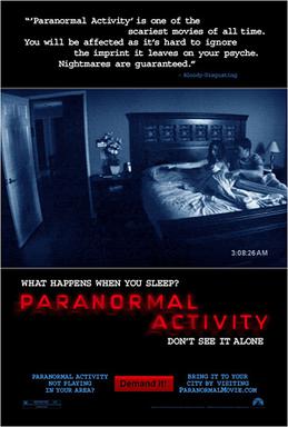
 The film poster shown for the film Paranormal Activity 2 is an example of how we aim to set out our film poster to support our teaser trailer for 'Sparganosis'. We have selected this poster as a starting point as we feel that it is very simple and straight to to the point. As well as this, we feel that the black background helps to create a dark mood which helps portray the genre of the film, in addition to this the simple and plain poster allows the audience to concentrate fully on the central image. Furthermore, having reviews from magazines and newspapers on the poster also has a good affect on the audience as they are more likely to persuade the audience to go and watch the film, leading the film to be more successful.
Initial Sketch:
 The image to the left is our original draft of how we plan our poster to look like. On the original draft we have annotated where we would like to put the most important things on the poster, such as the film title, the central image and reviews. On our poster we have decided that we would like like to include a tagline somewhere and also the age certificate of the film. After looking back at our first draft we have also decided that other things that we would like to include on our movie poster may be a website and also the name of directors and actors. One of the important things that we have left to decide is the size and what type font we are going to use for the writing. We have decided that for the majority of the fonts, we are going to use an online website called Dafont that provides a variety of fonts.

After creating a rough sketch by hand, we then drafted a simple poster on a word document of how we plan to layout our poster. We did this so that we could be more prepared for when we go onto Photoshop to produce our actual film poster. When using word to do our draft, we decided that we would use a black background as it helps to create a dark mood and atmosphere, we also decided that we would use white font, as it stands out a lot, and also to show the contrast between black and white, and the good and bad in the movie.
Synergy
From our research, we understood that one of the most important things that you must think about when creating a film trailer, assisted with a magazine cover and theatrical poster, is that they somehow all link together and share some essential things. One of the most important things that must appear on all three is the title of the film, of which we decided is: Sparganosis’. This is the most essential thing as it portrays what the trailer, poster and magazine cover are advertising and immediately tells the audience the main thing about the product.
Another element of the three products that is essential to have a link between is a main image that is being portrayed, therefore it is important that on at least two of the products such as the magazine and poster that we try to use the same central image, even if it may not be possible to make visual in the trailer. These must be the same to make the audience aware of important things that may be in the film, whether it be setting or characters.
Another element that we must assure is going to be the same on all our media products such as the poster and magazine, is that the font and colour scheme matches. A decision that we have already made is that we are going to use red as one of our main colours in the products, this is because we feel this colour is not only eye catching and relates to the horror genre, but also portrays things such as blood and danger of which help relate to our film. It is also important to make sure that we make other details included in our three products matching, such as showing the same release date and the same age certificate being shown. It is essential that the three products relate to each other and help to support the information being shown on all three of them. Through the three products the audience should be able to grasp a good idea of what the film is about, for example the genre of the film, a basic storyline and also who the antagonist/protagonist may be.
Creation of the Poster
Michelles' House
Another location that we plan to use is my house, we have chosen to use my house as it will allow us to do a variety of shots that are essential for our trailer. For example, we plan to use a long shot to show our character making a glass of water through a kitchen window. We also plan to film at my house, as it will show a natural environment and the mise-en-scene helps to create a realistic setting.
Josh's House
We also plan to use Joshs' house for some of our filming, as the mise-en-scene her such as a family living room will also help to create a natural environment. As well as this, we are planning to show our news report through a TV and then film this using an over the shoulder shot as if somebody is watching it, therefore Josh's house has the correct leads that are going to be needed.
Props, Costumes and Actors
For the majority of our filming we will not need any specific props or costumes. The only costumes at the moment that we feel are going to be necessary is making sure that the news reporters are wearing smart clothes such as suits, dresses and blazers. This will help to add to the mise-en-scene, so that the audience will be able to understand that there is important news being shown. The costumes for this scene will be easy to provide.
When we film the news reporters we need to make sure that Chloe will be available at the same time as us. All three of us in the group need to be there, Sam will be playing a news reporter and then either myself or Josh will be filming and the other directing. When we film this part we will need to make sure that the green screen is available and that nody else will be in the room.Other props that will be needed for some of the scenes, are stuff such as empty water bottles.
For the trailer the main acting roles have been allocated to me, Sam and Josh. By doing the majoirty of acting ourselves we reduce the risk that people will be unavailable when we have to film or re-film any unsuccessful and extra shots.Aswell as this, by using ourselves as the actors we will be able to portray the characters and messages within the trailer in the way which we imagine them.
Michelle Roberts: I will play the part of the final girl in the film, of whch we are going to try to make apparent to the audience by including me in the majority shots of the trailer. I was selected to play this part in the trailer as I have studied drama for a number of years and therefore I will be able to follow any acting directions and will know about body positioning for when I am being filmed.
Sam Sadler: Sam will stand in and play one of the infected antagonists such as in the shot planned to show the shadow getting up and representing the antagonist. Sam has also studied drama and does a lot of acting and therefore will be able to understand what body positions he needs. As well as this, as using infected antagonists such as zombies was one of Sam's ideas, he will be able to act the way that he had imagined it.
Josh McKnight: Josh will also stand in and play the role of the antagonist whenever required. For example, when Sam is filming. We have chosen Josh to stand in for this part as he will always be there and will always be available to stand in.
Film Title
Originally we were to name our film ‘Nemesis’ however it clashed with our films slogan of “A necessity becomes a nemesis”. As the title and slogan clashed we researched several water viruses and found ‘Sparganosis’. Sparganosis is an infection which is spread by the contamination of water therefore we believed it would be appropriate for the name of our film. As well as being linked to the main theme of our film it is also a unique title of which is not associated with any other films such as Nemesis with Star Trek: Nemesis.
Planning For Magazine
Choice of Magazine, Construction and Layout Analysis

For our own magazine cover we have decided that we want to create our own original magazine title, one of the reasons that we have decided this is because we felt that when doing our research, there weren't many magazine covers that featured any horror films that follow the 'apocalypse' sub-genre. After doing a lot of research and coming up with a variety of ideas, the title that we together decided on was 'EMINENT'. We felt that this would be a good catchy title and would be able to attract an audience.
We feel that this would be a good magazine layout to follow as the central image is very eye catching and also exemplifies an important character in the film that is being advertised. In addition to this we also think that the colour schemes and fonts have been kept very neat and tidy and that they all match each other to make the magazine cover seem very professional. Also, the big bold title being in red also gives us the idea to use the colour red for our fonts in the magazine as it portrays blood and gory images. As we are going to choose the colour red to use in our cover we will also make sure that it is used for our poster so that we are showing continuity through our media products.
Initial Sketch:


After creating a rough draft by hand, we then decided to do a rough draft on a word document so that we can get a realistic look at how the magazine layout will look and approximately what sizes we would like the title, tag lines, cover lines and slogans.
After creating this we then looked on DaFont to get an idea of what kind of fonts we would like to use for the different writing on the magazine cover. When we designed the magazine on a word document, we made sure that we left an appropriate amount of space in the middle so that the central image would stand out enough.
Another decided that we need to make when it comes to making the actual magazine cover is the price that we would want it to be and where we want the price tag to be.
Planning For Poster
Choice of Poster, Construction and Layout Analysis

Initial Sketch:


After creating a rough sketch by hand, we then drafted a simple poster on a word document of how we plan to layout our poster. We did this so that we could be more prepared for when we go onto Photoshop to produce our actual film poster. When using word to do our draft, we decided that we would use a black background as it helps to create a dark mood and atmosphere, we also decided that we would use white font, as it stands out a lot, and also to show the contrast between black and white, and the good and bad in the movie.
Synergy
From our research, we understood that one of the most important things that you must think about when creating a film trailer, assisted with a magazine cover and theatrical poster, is that they somehow all link together and share some essential things. One of the most important things that must appear on all three is the title of the film, of which we decided is: Sparganosis’. This is the most essential thing as it portrays what the trailer, poster and magazine cover are advertising and immediately tells the audience the main thing about the product.
Another element of the three products that is essential to have a link between is a main image that is being portrayed, therefore it is important that on at least two of the products such as the magazine and poster that we try to use the same central image, even if it may not be possible to make visual in the trailer. These must be the same to make the audience aware of important things that may be in the film, whether it be setting or characters.
Another element that we must assure is going to be the same on all our media products such as the poster and magazine, is that the font and colour scheme matches. A decision that we have already made is that we are going to use red as one of our main colours in the products, this is because we feel this colour is not only eye catching and relates to the horror genre, but also portrays things such as blood and danger of which help relate to our film. It is also important to make sure that we make other details included in our three products matching, such as showing the same release date and the same age certificate being shown. It is essential that the three products relate to each other and help to support the information being shown on all three of them. Through the three products the audience should be able to grasp a good idea of what the film is about, for example the genre of the film, a basic storyline and also who the antagonist/protagonist may be.
Creation of the Poster
This shows the process of which we went through to create the Sparganosis poster; we included several print screens to provide evidence for what we did whilst creating the image. We decided to use the image of a shadow rising as it is in our trailer and therefore people will be able to identify the shot with our film. As well as this we are using similar images throughout our work which links the pieces of work together.
 The next stage of our poster editing involved putting lines above and below the central image; we did this to ensure that the focus is on the main image of the shadow. As well as this it also separates the page allowing us to use the excessive space for reviews and production companies etc. We also added our title of ‘Sparganosis’ which is again in the same font as the magazine and trailer; it is essential to maintain the font as people will recognise the film through the titles, if the fonts were to change however people may not recognise it is the same film which could be costly as it may result in less people going to see the film.
 This next image shows the poster with the titles; originally the quotes were also in the impact font of which was used for Sparganosis, we decided to change this however as we believed that it was not clear what the film title was. We also promoted our own magazine by using a quote from Eminent, this again makes the magazine appear to be one of the best as it has given a similar review to the well-respected IMDB site. We also had to change the colours of the sources reviewing our magazine as they were not the same at this point, to conquer this problem we copied the same word and re-wrote it, therefore leaving us with the same colour. The colour of the sources also represents water, of which are the main themes throughout our film. We also organised the comments and sources so they look disorientated, this then foreshadows that the events to come in the film are going to be fairly disturbed and unnatural i.e. those who have been affected by the water virus.
 At this point we decided to experiment using our films main slogan of a necessity becomes a nemesis; we altered the position of the slogan various times as shown on the print screen, the position shown on the image however is not the final position of which we pursued. Also on the print screen I have shown the layout properties being changed; this is so that it was easier to edit as it was confusing which layer was which when they were previously named layer 1 etc.
This is the one of the completed posters which we did not use; we were undecided on whether to have an exact date, coming soon or to leave it blank hence why we created an alternative. However after looking at other posters, such as Paranormal Activity we decided to leave it blank as Paranormal Activity was still a successful film despite not promoting the release date for the film; by leaving the date off it also prevents the poster from becoming too ‘crammed’ with information.
This is our final chosen poster. On the final poster we have displayed the 15 certificate for the recommended age group for our film making the audience aware of the content to expect to see e.g. containing moderate violence. As well as this we have also included our production and distribution company IFC Films as well as awards of which the film has received from Festival De Cannes.

Creation of the Magazine

We then added a rain effect to the image to emphasise that our film is about a water virus. We also added an orange smoke effect to the image to create a look of destruction.

Next, we created the Masthead for our magazine. We came up with 'Eminent' as this we felt we needed a name that meant the best to represent that it is the best magazine around. We used the Iron Maiden font from Dafont for the title.

After finishing the background and the masthead for the magazine, we then made a skyline and also a website to be added on. The skyline that we have used is a quote from the film. We felt this would be an effective skyline because it is a bold statement and it will make people want to buy the magazine and find out what the pandemic is.

The next thing that we added on to our cover was a 'Dead End' sign. This connotes the nature of our film, which is that life is coming to an end because of a water virus.

The thing that we focused on next was adding our central image to the magazine. We brought this stock image from photoshop because it looked effective of somebody who has contracted 'sparganosis'.

Our next step was adding on a barcode to the magazine, and also a website for the featured film. We then added coverlines to the left third of the magazine. We chose to put them on the left side because our research shows that it is the part of the magazine that will be noticed when they are stacked up in shops.

We had now added all the images onto the magazine and the next stage was adding more anchorage text which again were quotes from the film. This is effective as it will promote our film. We also inserted a quote saying that it is 'the most awaited film of the year' this will also encourage people to watch it.

The final thing we done was added the title of our film 'Sparganosis' to the magazine, we made sure that this was one of the biggest pieces of text on the magazine to make sure the audience know what the title of the film is. We also added a puff, 'Zombie month June 2011' because it is advertising an offer from the magazine.
